Last updated on March 18th, 2024 at 01:01 pm
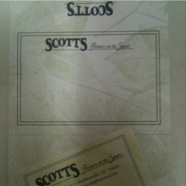
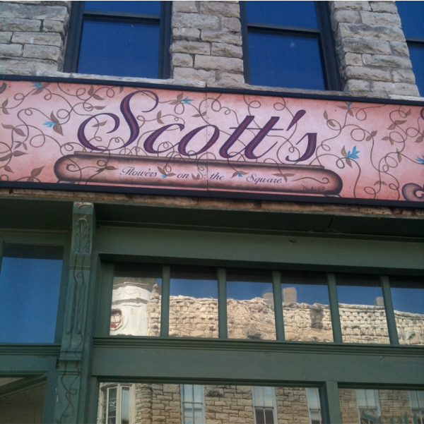
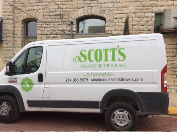
Logo renewal is not an as easy task as it seems. This is a case study of a project to refresh an existing logo for a florist, Scott’s Flowers On The Square in Stephenville, Texas. The shop is located in a historical area downtown. The business has been in Stephenville since 1975. They had slightly different logos on the business card and delivery van. Their storefront sign also had a very different look which they felt it was busy and hard to read.
Our goal was to create a simplified yet memorable logo that can be used on various items they use for business, including shirts and wax seal stamps. A fresher approach was important for their next business step, but it also needed to maintain the overall brand image that had already been established.
This case study is a little journey from here …


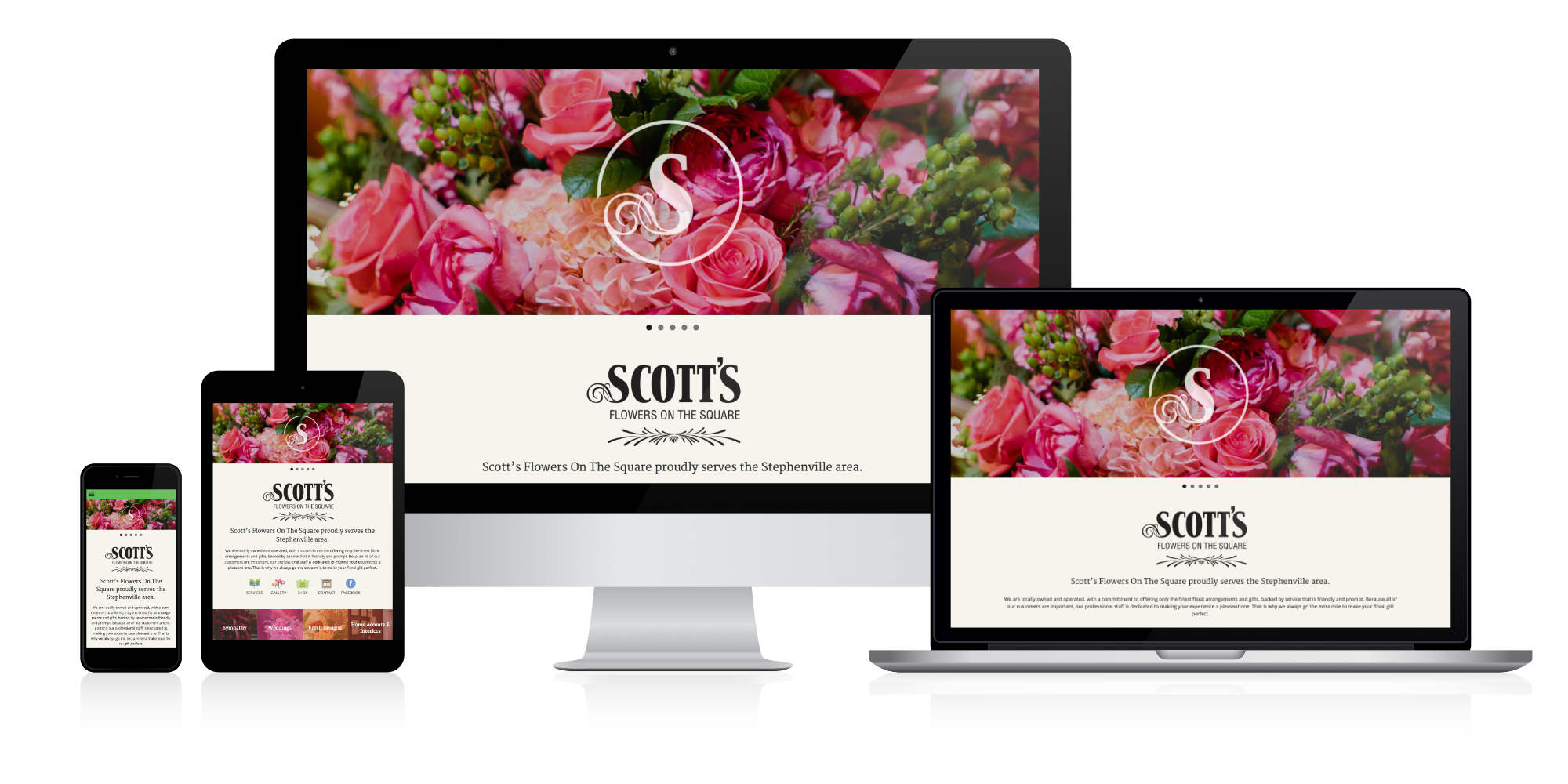
… to here.


In the next post, I will talk about our conceptualizing process, maybe with some snapshots of our notebook. Please check back later for Part 2.
